
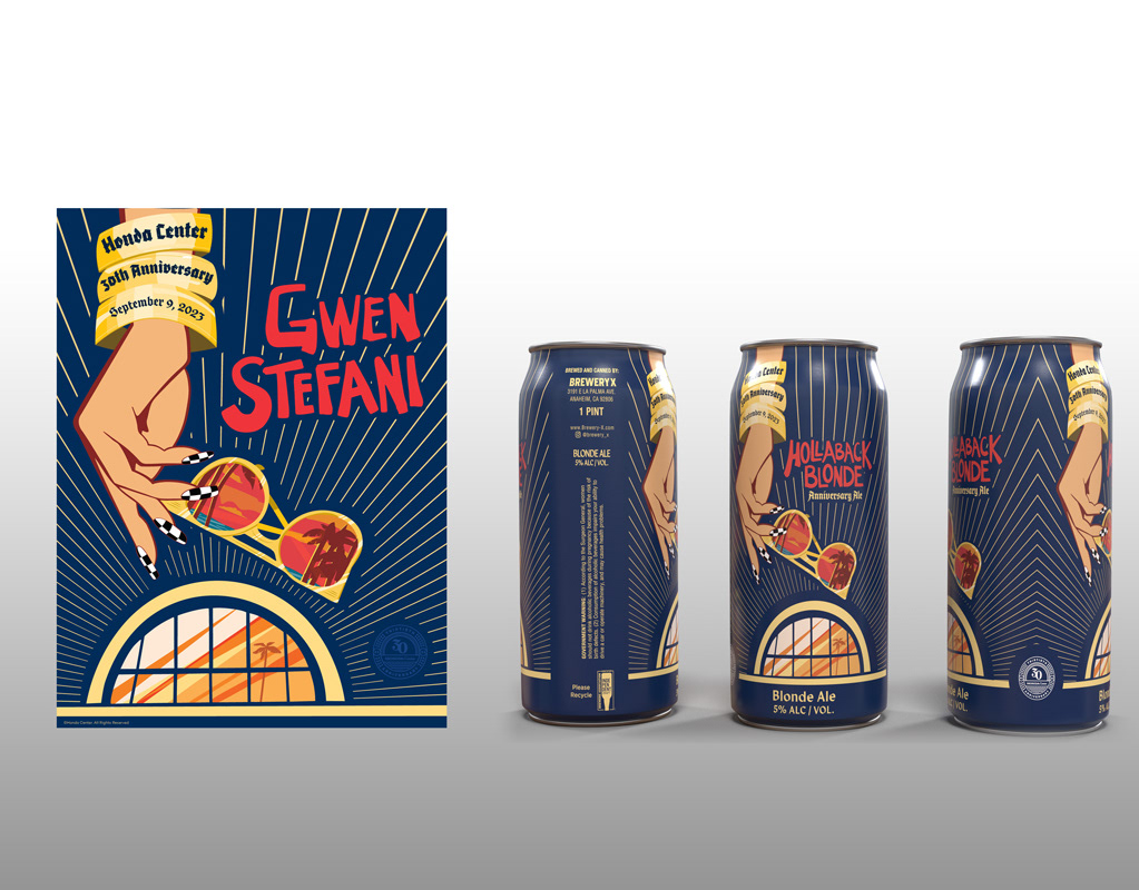
Honda Center 30th Anniversary with Gwen Stefani
In a career milestone I served in a pivotal role at OCV!bes. I led a dynamic creative campaign for our client, Honda Center, 30th anniversary show, featuring the iconic Gwen Stefani.
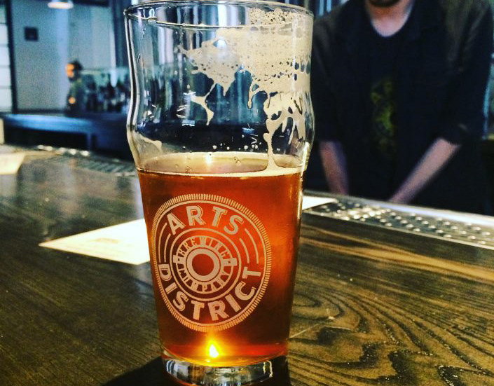
Arts District Brewing Company Branding
In collaboration with CauseConnect® I developed the brand strategy and design for Arts District Brewing Company. Initial interviews with the client brought several points of inspiration but most notably the original rail lines that ran through downtown Los Angeles. After beginning initial research we decided very early on to bring on master type artist Peter Greco to inform the process of developing letterforms.
As a team we have worked together before which is an enormous asset to expediting projects like the ADBC work which was on a fast track. A cornerstone of the partnership between CauseConnect, Peter Greco and myself is research. Which is, early on my primary role. To identify when appropriate historical context as it relates to the clients mission and approach. The research found inspirational details in everything from the buttons on rail conductor uniforms, the local art scene and even the top of a classic wooden beer barrel.
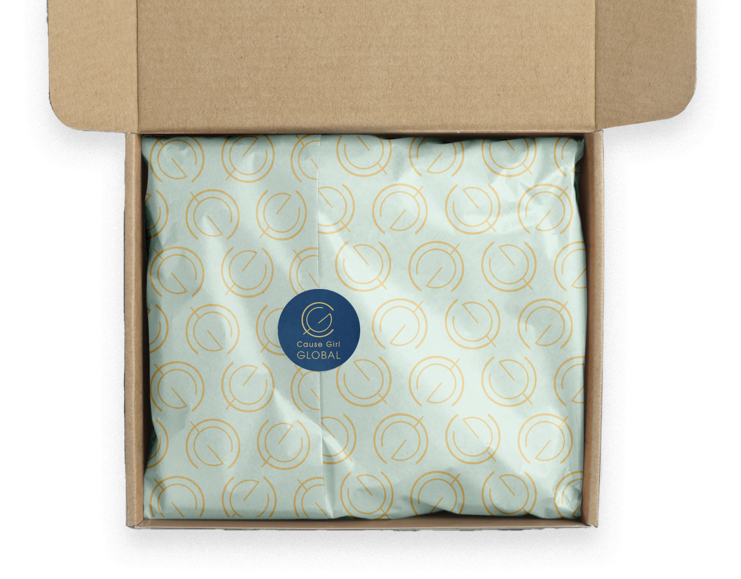
Cause Girl
The CauseGirl brand had both immediate needs like assets to launch the podcast and blog as well as providing brand projections for additional verticals in the project including subscription services for physical and digital products. The podcast is now moving into season 2 and maintains a 4.9 star rating!
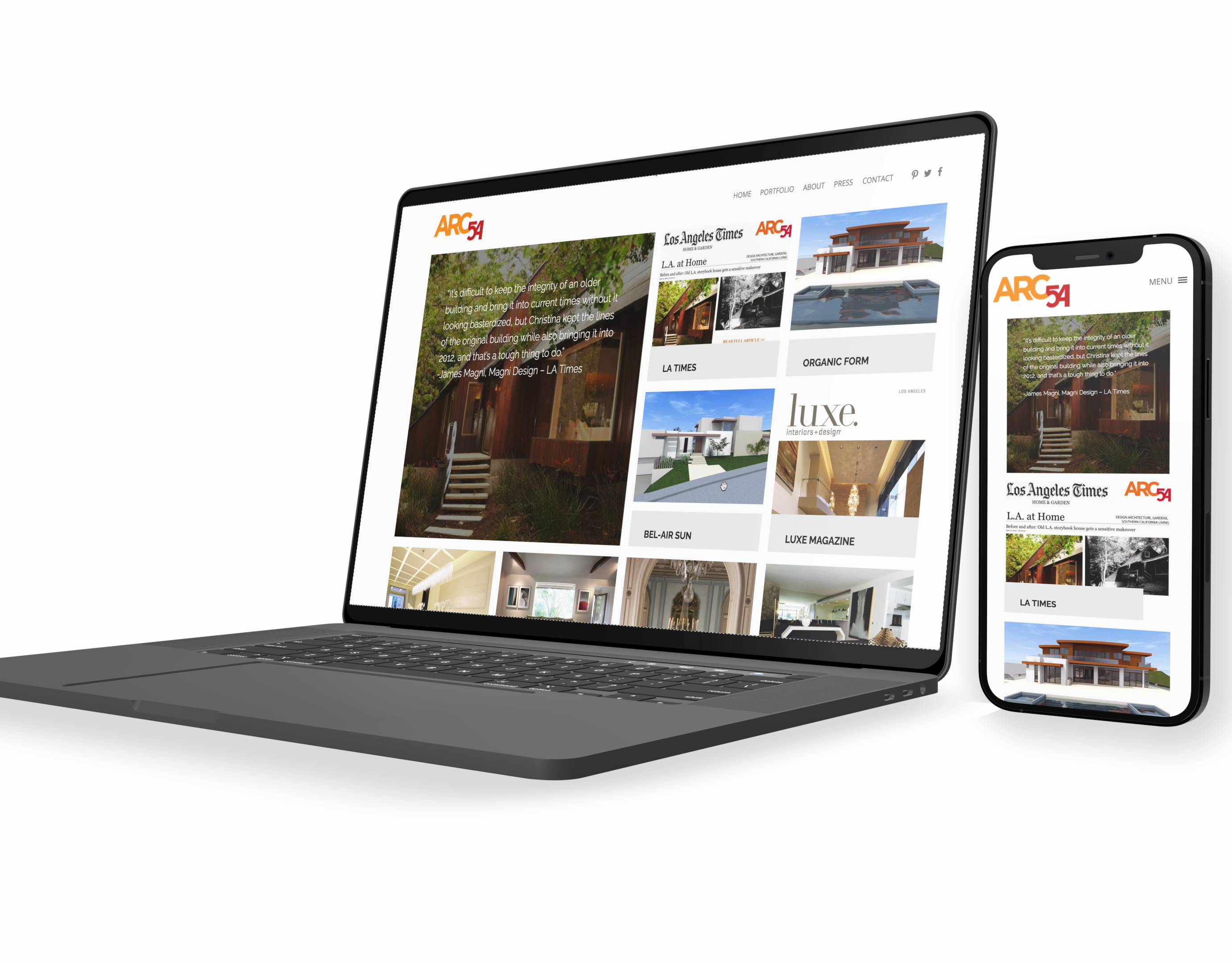
ARC54 Studios Website
Christina Craemer's ARC54 studio site, is a minimal responsive development built with a CMS to highlight her career accomplishments and attract new clients.
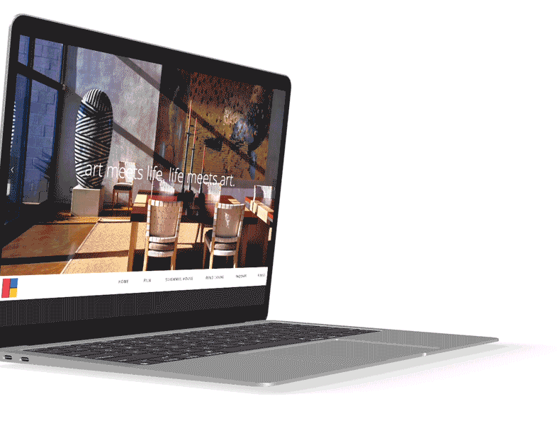
Stremmel House Website
The Stremmel House website is a responsive, 1 page parallax website. It's design was to showcase both the extraordinary Stremmel House and it's stunning features to prospective buyers.

Ferment 'N Joy
Logo, Packaging design with recipe booklet, and website development for LDK Products. Ferment 'N Joy is the latest in a line of products. With a five star rating on Amazon the product line continues to grow and gain popularity.
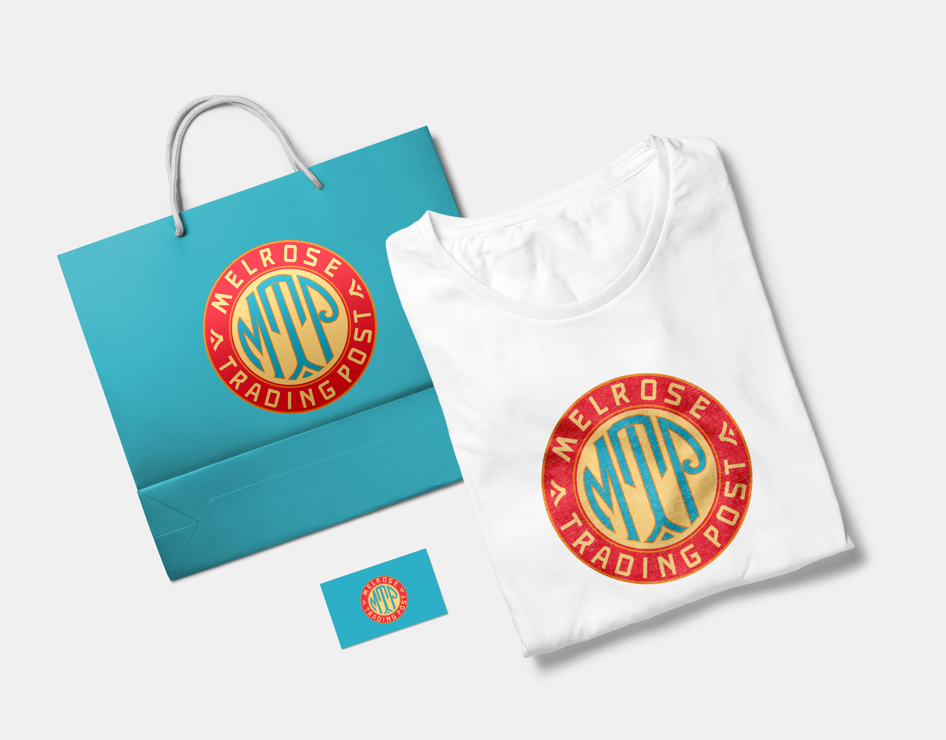
MTP and Greenway Arts Alliance Organization Rebrand
The Greenway Arts Alliance was a formidable scope of a rebrand that spanned four separate organizations; Greenway Arts Alliance the parent organization, Greenway Institute for the Arts, Greenway Court Theatre, and Melrose Trading Post. The branding began with the sub organizations with Melrose Trading Post as the cornerstone.